screen_shot_2013-06-17_at_3.11.06_pm.png

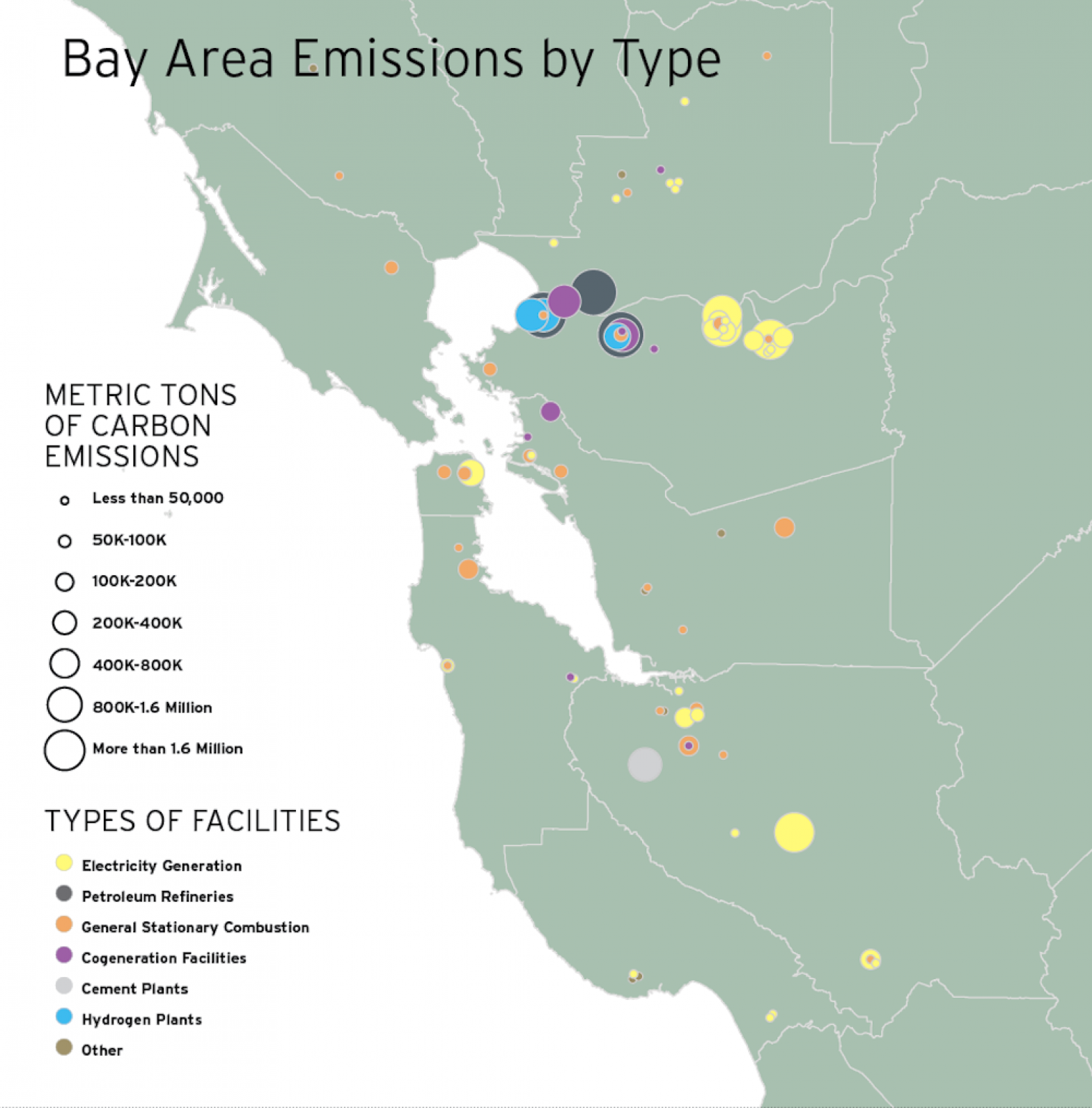
Mapping California’s Biggest Polluters

Carbon dioxide, as everyone knows, is invisible. But with a little mapmaking magic, the greenhouse gas comes into sharp view in a rainbow of colors, and shows clearly how and where California contributes to global warming. California’s cap-and-trade program requires the largest emitters of greenhouse gases to pay to pollute. Each metric ton of carbon dioxide (or other greenhouse gas equivalent) requires an “allowance,” with the total supply (the “cap”) falling each year. These maps show the largest emitters. This is part of a special report on climate change in the Summer print edition of the San Francisco Public Press.

b01-06_the_bays_50-year_boom_small_size.jpg

Map: The bay’s 50-year boom — population growth, 1960-2010

Among 101 cities, those in periphery grew fastest
Like trees, cities can be thought of as adding growth rings every year. For most cities on this map, the outer ring represents the current population, from 2010 census data. The smallest, inner growth ring was the population in 1960. The largest cities of 1960 — San Francisco and Oakland – have larger inner rings. San Jose is a notable outlier, having swelled to consume the Valley of Heart’s Delight. The spacing of the decennial rings allows the reader to understand whether cities’ population growth is sudden, like Concord between 1960 and 1970, or gradual, like Pleasanton, denoted by the regular interval between the growth rings. Slow-growing Moraga doesn’t show a 1960 ring at all, because it is covered up by the 2010 growth ring.

b01-06_where_we_live_now_small_size.jpg

Map: Where we live now — 2010 household density and priority development areas

Part of the challenge facing regional planners, who wrote the 30-year Plan Bay Area, is that it is hard to predict future population growth. The current list of more than 200 potential priority development areas in the plan tracks established high-density zones closely, indicating that the Association of Bay Area Governments, the Metropolitan Transportation Commission and other regional agencies want to fill in developments in areas that are already highly urbanized or near mass transit lines, instead of in undeveloped or underdeveloped suburban settings. This map helps readers of the Public Press’s summer edition special project, Growing Smarter: Planning for a Bay Area of 9 Million, understand these trends.